Refined Touchpoints Drive Quality Perceptions
Today, a medical device must be more than functional; it must also look and feel sophisticated. Device designers can use refined touchpoints to influence users’ perceptions of the quality of a device.
November 1, 2007
PRODUCT DESIGN
|
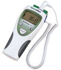
This digital thermometer is sculpted to fit in one hand and has a pleasing look. Photo courtesy of Welch Allyn. |
Certainly the most important thing for a medical device is to perform its function properly. Ventilators have to pump gas into and out of a patient's airway reliably. Patient monitors must receive signals from sensors with minimal artifacts. Endoscopes need to articulate and provide a clear image of the stomach lining. But these capabilities are givens in an industry in which devices require regulatory approval based on efficacy, even though they might require remarkable engineering efforts. So, adopting a human factors engineering mindset, let's move on to the subject of making the interactive experience something special. We will approach this topic by way of the local appliance store.
Consider how the typical consumer shops for a kitchen appliance, such as an oven range. Of course, the consumer will ask the salesperson about the range's fundamental capabilities, such as convective baking and self-cleaning. However, the customer will also judge the range's look and feel by opening and closing the oven door, sliding the racks, and turning its burner controls. In performing these actions, the customer is essentially testing the product's quality via the available information channels—eyes, ears, and hands. The consumer will assess several aspects. Does the oven door open and close smoothly, or in a jerky manner? Do the racks glide precisely while making a pleasing sound, or do they rack in their tracks and emit a metallic screech? Do the controls feel nice and turn precisely, or feel wobbly and plasticky? Depending on the quality of a selected range's touchpoints, the consumer will make telling comments, such as “that's awful” versus “I really like this one.” The effect on sales is obvious—people buy the range with a pleasing feel—the one with better touchpoints, consciously or unconsciously associating fine tactile and aural qualities with fine overall quality.
What bearing does such consumer behavior have on the design of medical devices, including capital equipment and disposables? Some clinicians report that they are insulated from buying decisions—that such decisions are made at a higher level, driven primarily by economic considerations and habit. However, a greater proportion of clinicians report having considerable influence on device selection, citing among their powers the ability to reject trial devices that “just do not work in their unit.” Therefore, a manufacturer's efforts to produce devices with refined touchpoints should pay off, giving users a positive overall impression of their device initially and generating satisfaction over the long haul.
Refined Touchpoints
It is important to consider how to produce medical devices that have a pleasing feel (i.e., great touchpoints), keeping in mind that the biggest payoff should come from refining those design elements that users see, hear, and touch the most (e.g., the steering control on an endoscope).
|
This range's controls turn with precision and have a simple, elegant design. |
Connections. Users want to be assured that when they make a connection, such as plugging an ECG cable into a patient monitor, the connection is complete and secure. Sometimes users will focus their full attention on making the connection. Other times they might be multitasking and need to connect a cable by feel alone. Therefore, good tactile cues and feedback are crucial. Accordingly, designers should consider the following:
Provide an obvious and convenient means to grip components in an orientation that facilitates the motions required to make a connection.
Provide one or more tactile cues to signify that the connection is made, such as a click or obvious bottoming out.
Limit the force required to make or break a connection.
Ensure that a connection's status (whether made or broken) is visually obvious.
Require users to perform a deliberate step, such as pressing a plunger, before they can separate components.
Give gripping surfaces a pleasing texture, such as the suede-like feel of Santoprene, particularly if users are likely to handle the component with their bare hands.
|
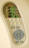
Push buttons on this control panel for a scanner are large and well spaced. |
Push Buttons and Keys. Not all push buttons (a.k.a. keys) are created equal. Some feel like mush when you press them, creating doubt about the signal getting through. Others feel crisp, leaving no doubt. Here is some advice for designing people-pleasing push buttons.
Make the buttons ≥0.5 in. tall and wide, or ≥0.5 in. in diameter, and space their center points about 0.75 in. apart. This spacing helps users hit the right button without worrying about pressing the wrong one.
Make the push-button cap slightly concave to capture the fingertip, preventing it from sliding off.
Eliminate key wobble—a notorious characteristic of some elastomeric push-button pads designed to prevent fluid intrusion at the expense of overall feel. Users are typically drawn to mechanical keys that track precisely, have a moderate amount of travel, and bottom out in a definitive manner. Placing a mechanical key over a sealed snap-dome switch is another nice solution. Even elastomeric pads can be engineered to give a more controlled physical response to button presses, notably by hinging one side of the button.
Backlight the push buttons if the associated device might be used in dimly lit environments, such as a catheterization lab or an endoscopic procedure room. Even better, add in a light sensor so that the backlight turns on automatically when needed.
|
These patient monitor leads are dished to ease gripping. Photo courtesy of Philips Medical. |
Handles. Most medical devices get moved around quite a bit. Hospital beds, for example, move among various care units, diagnostic centers, and therapy rooms. Infusion pumps make their way from IV poles to workstation counters to closet shelves. Parts of devices, such as radiation targeting components placed on swivel arms, are frequently pulled into position and then pushed away. Accordingly, users need well-placed, comfortable handles to facilitate device movement.
When designing the handles, do not force users to adopt a particular grip by molding finger positions. Rather, allow users to hold a handle as they see fit. Grip flexibility is key to accommodating a wide range of hand sizes as well as use scenarios and user preferences.
|
An x-ray technician maneuvers an imaging mechanism using convenient, oversized handles. |
Oversize handles so that people with wide hands can get a secure grip. However, limit handle thickness so that people with small hands can effectively wrap their hand around the handle, establishing a power grip.
Consider padding a handle, or at least giving it a soft texture. Padding will help avoid placing point stresses on users' hands. A soft texture will give it a higher-quality feel and potentially feel like padding. However, be sure that the texture does not conflict with cleaning requirements.
Nonslip features, such as slightly raised ridges, can help ensure a secure grip by a wet, gloved hand. Again, ensure that the ridges or other nonslip features do not complicate cleaning.
Handles should feel solid and not flimsy so that they reassure users that the handles are made of a strong material that is not vulnerable to bending and that they are solidly connected to the associated device.
Angle handles so that users can maintain a neutral hand position (neither flexed nor extended) when gripping it. Note that a neutral hand position also enables users to apply a lot of force on the handle, if necessary. Generally, a substantially flexed or extended hand is unable to generate as much gripping and lifting force, for example, and is more subject to physical trauma due to overexertion.
Give handles a distinct appearance that differentiates them from other components. You want the handle's appearance to say, “Hold on here.” For instance, it is common to make handles a contrasting color, such as medium blue, to stand out against a device's white or silver enclosure.
|
|
Images from a hospital bed. The brake and steering are easily accessed by foot. Bottom: Casters are covered to prevent contamination and to enhance appearance. Both images courtesy of Stryker. |
Wheels and Casters. Is there anyone who hasn't struggled with a supermarket shopping cart that tracks poorly and makes awful noises as it crabs down the supermarket aisle? It is not pleasant and certainly not something a user wants to experience when moving a portable X-ray machine down a narrow hospital corridor. Therefore, even though a user might not actually touch a wheel or caster, the components affect handling and produce sounds, qualifying them for consideration as another important touchpoint. Here are some design tips.
Engineer the wheels or casters, particularly their housings and bearings, so they are not prone to flutter (i.e., rapidly swiveling back and forth).
Use hard wheels for rolling predominantly on carpets, and slightly softer wheels for rolling predominantly on hard flooring (e.g., asphalt tiles and the like). Very soft wheels are prone to experience rolling resistance on both types of flooring.
Make the wheels sufficiently large to enable movement across door thresholds, gaps between floors and elevator cabs, and the myriad wires and tubes that run across floors.
Enable users to easily engage and disengage brakes and to identify the brake's status. Ideally, equip portable equipment with a single brake, as opposed to requiring users to set a separate brake on each wheel or caster.
Make the casters functionally attractive, conferring a sense of refinement to the overall device, rather than detracting from it with an overly industrial appearance that is better suited to trash a container. Sometimes a wheel housing (i.e., cover) can serve the dual purpose of enhancing appearance and simplifying cleaning.
Other Moving Parts. People develop an immediate sense of high or low quality when they first sit in a car. The quality, or lack thereof, is readily transmitted by the feel and motion of un assuming components, such as the turn signal stalk, seat belt release, parking brake lever, and seat adjustment controls. Similarly, a medical workstation's swivel arm, flow-control knobs, syringe holder, and storage drawers will affect a user's perception of quality.
Steps toward creating a positive impression can be varied. For one thing, designers should make sure parts move smoothly and precisely. This goal can be achieved by careful material selection and finishing, as well as by setting tight tolerances, which will minimize misalignments and gaps that interfere with smooth motion. Some of the best-feeling parts, such as the focus control found on some microscopes, have a somewhat weighted or damped feel, communicating a sense of mass and momentum, or what some people might perceive as pleasing viscosity that facilitates precise adjustments.
Ensuring an obvious and comfortable means to grip a component, even if a particular component might not warrant a handle, is another critical feature. In addition to guaranteeing comfortable interaction, this step might also prevent users from damaging a delicate component.
|
Contouring can provide a comfortable and obvious grip. Photo courtesy of Acuson Ultrasound. |
Where appropriate, indicate a particular component's proper positions. This can be accomplished by incorporating detents, causing a lever, for example, to snap or drop into place. It also helps to label the possible positions graphically or with text.
Styling. It is well established that people are drawn to attractive designs over homely ones, which explains the thriving industrial design profession. That said, people will disagree vehemently over what constitutes attractive design. One person might find beauty in a streamlined appearance while another might prefer something edgier. Still, attractive medical devices share some characteristics that we can treat as design guidelines.
Err on the side of visual simplicity, recognizing that many clinicians prefer devices to blend in, rather than stand out. Most clinicians have little appreciation for a piece of equipment that shouts, “Look at me!” In fact, some would consider overstyling for the sake of drawing attention to be antithetical to a given device's purpose, which to perform a supportive function, rather than entertain the eye or compete for attention.
Use design to express functionality and facilitate tasks. For example, a blood gas analyzer's enclosure might be sculpted to focus attention on a sampling port where users inject blood samples.
Icons for labeling product features should be graphically pleasing and intelligible, thereby enhancing usability and adding visual appeal.
Color can be employed to visually code components for rapid recognition. As mentioned before, handles might be colored blue to stand out against a white enclosure. Certain controls might be colored to match associated functions and materials, such as coloring an oxygen-related control green (if intended for use in the United States). Also, ensure that colors are harmonious and do not fade over time due to environmental factors such as ultraviolet light exposure and chemical washing.
Do not go overboard with device branding. Large logos tend to make a medical device look tacky and can compete with clinically significant information for visual attention.
Miscellaneous. Here are just a few more tips on imbuing devices with pleasing touchpoints.
Minimize or hide molding defects (e.g., shrink marks, flow marks, color streaks) that give parts a plasticky look and give them an unrefined feel.
Avoid exposed fasteners that give devices a more primitive appearance and can be hard to clean.
Avoid sharp edges and corners. Instead, radius them—even if only slightly—so they feel better and do not pose a hazard to the skin or protective gloves. A slightly radiused edge can still look crisp if the device's styling calls for it.
Ensure that labels, whether they are printed, adhered, or molded in, are not subject to undue wear (e.g., rubbing off during the extended life cycle) that could make them illegible.
Designer Input
|
A driver for an artificial heart designed by Michael Cattafe Associates for Syncardia Systems. |
Michael Cattafe, an industrial designer and president of Michael Cattafe Associates (Maynard, MA), has an extensive medical device portfolio, which includes a driver for an artificial heart. He has observed that caregivers are drawn to products trimmed with natural aluminum or brushed stainless steel because the materials confer a sense of durability. He opines that “flush surfaces between parts look more refined than offset surfaces,” but notes that making surfaces meet on the same plane can complicate the manufacturing process and increase costs.
Regarding larger devices that are not meant to be carried by hand, he says that “users notice and appreciate a feeling of solidness. A device's surfaces should not give or bend too easily. Surfaces should not sound tinny or empty.” He suggests placing labeling that has no likely significance to the end-user in inconspicuous locations. And, recognizing that small details can influence how a device is perceived, he advises to “color match the power cord.”
Continuing to focus on color, Cattafe suggests choosing colors wisely because users' first impressions of a medical device can swing one way or another based on color selection. He notes that painting a device the perfect color usually costs no more than painting it an off-putting color that could stunt sales. He observes
|
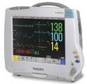
A soft-textured handle like the one on the IntelliVue MP40 can enhance the product's enclosure. Photo courtesy Philips Medical Systems. |
Many medical devices use a light color or white as the primary color. If you go this route, be sure to choose a light color that looks “fresh” in today's environment (follow current consumer product whites, if you are not sure which to use). Accent and coded colors (i.e., colors with assigned meanings, such as green for oxygen) should complement the white and each other. A bad combination can ruin that first impression. Accent colors should be low to medium in contrast to the primary color (be careful about midtones, because applied graphics may not read well from a distance). If you are unsure about color combinations, use grays in combination with whites, or alternately, seek out people in your organization that are naturally good with color and find physical examples that please. If corporate logo colors clash with a chosen product color scheme, mold the logo into the housing and eliminate the color problem. Richer, darker colors can also be used in certain circumstances, such as with portable devices.
Larry Hoffman, a senior industrial designer with Philips Medical Systems —Ultrasound/Monitoring Group (Andover, MA), says, “I seek to ensure that nothing about a medical device detracts from the caregivers' ability to use it effectively.” Accordingly, he feels disdain for devices that incorporate gratuitous styling details that serve no functional purpose. That said, he seizes the opportunity when it arises to introduce style with a functional purpose. He cites, as an example of functionally relevant styling touches, the work of his colleagues on Philips' IntelliVue MP40. Specifically, he admires the manner in which the patient monitor's soft-textured handle integrates physically with the enclosure while adding a pleasing visual accent to the device's overall form.
|
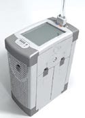
The convenient organization and feel of Philips' Telemetry Transmitter makes it a favorite among product designers. |
He notes that the handle is sized to accommodate a large hand and positioned on the device to encourage users to point the device's screen inward toward their legs, rather than facing outward, thereby protecting it against the inevitable impacts caused by carrying it through halls and doorways. He also admires his colleagues' work on the HeartStart AED. “The designers worked hard to get the voice that provides operational instructions just right. It sounds authoritative as well as calming,” he says about the talking device. Hoffman also feels the HeartStart strikes an excellent balance between looking imposing versus toylike by virtue of its blue plastic enclosure and red case.
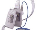
Asked to choose a favorite among his own design efforts, he cites Philips' Telemetry Transmitter as one with excellent touchpoints. He opines, “The transmitter, which is shaped like a taco, fits naturally in a nurse's hand. Although made of plastic, the transmitter feels solid when you grip it. All of the parts line up precisely—not by luck, but because they are engineered to fit together perfectly.”
Conclusion
Years ago, the automotive industry coined the term NVH, standing for noise, vibration, and harshness. Arguably, NVH had little to do with an automobile's ability to travel 100,000 miles with minimal maintenance. Rather, it had to do with customers' initial perceptions of the automobile and their satisfaction after many miles of driving. Historically, Japanese automakers have led the industry in regard to NVH, but other automakers have worked hard to match or exceed their benchmark.
In the medical industry, there is no NVH measurement per se. However, engineering teams make daily decisions affecting a medical device's level of refinement. Sometimes a high level of refinement might not be possible for economic reasons. However, the refinement of a device's touchpoints might be sacrificed unnecessarily due to neglect, or a misguided sense that the added cost (perhaps just a few cents or dollars in total manufacturing cost) is not worthwhile but rather is an unnecessary luxury. The expression “penny wise and dollar foolish” is an apt sentiment for such occurrences. Clinicians and purchasers will always confirm that a medical device does what it is supposed to do. After that, the degree to which the quality of a medical device's touchpoints effectively communicates the overall quality of the product can mean the difference between a sale and a lost opportunity.
Accordingly, while keeping sight of the need to control costs, it is useful to think of user interface refinement as a necessity rather than a luxury. Moreover, refinements do not always have to increase costs. Instead, they can arise from clever design, engineering, material selection, and manufacturing.
Michael Wiklund is founder and president of Wiklund Research & Design Inc. (Concord, MA). He can be reached via his Web site at www.wiklundrd.com.
Copyright ©2007 Medical Device & Diagnostic Industry
You May Also Like
