Sign up for the QMED & MD+DI Daily newsletter.
PRODUCT DEVELOPMENT INSIGHT
Bill Evans
May 1, 2007
16 Min Read
.svg?width=850&auto=webp&quality=95&format=jpg&disable=upscale "Design Research Part 1: Creating Better User Interfaces")
PRODUCT DEVELOPMENT INSIGHT
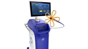
As the potential of the technology that goes into medical products grows, so does the need for product design features that make them accessible to users. The drop in cost of both processing power and high-resolution color screens, for example, means they are finding their way into many areas of healthcare. At the same time, the typical medical device user in the developed world is routinely exposed to sophisticated consumer user interfaces (UIs). Products like TiVo, iPods, cell phones, Apple computers, and Microsoft Windows have raised the bar in terms of consumer expectations. Consumers now have an idea of how easy it can be to interact with a piece of complex technology (see Figure 1).
The consumer devices mentioned here have been designed for a broad user base—from ages 8 to 80 is a common goal. But medical products are usually designed with a specific group or groups of users in mind. How can product development teams design UIs that really resonate with their particular customers? A truly great UI allows a user to more effectively exploit all the sophisticated features the design team slaved over to give the product a competitive advantage. An intuitive UI matches a user's mental model of what they need to do to operate the device with how the device actually works.
|
Figure 1. As diagnostic and therapeutic techniques become more automated, the need for more-sophisticated UIs grows. Photo courtesy of the University of Utah. |
Manufacturers can use design research to create better UIs. This article addresses how to conduct the early research and create concept UIs. The second part will explain the process of taking these concepts back out to users. It will also address how development teams can lay the foundation to meet FDA requirements for usability and good human factors design and the validation process.
What is Design Research?
Design research is a kind of market research that leads to the specification of the product design, and it is performed by a design team. Rather than passive data collection, design research entails an iterative process of criticism and refinement. An initial discovery period searches for design issues out in the field. Next, potential solutions are brainstormed, and finally the design team returns to the field.
It is important that the design team partners with users. More-traditional forms of market research, such as large-scale quantitative methods, may help a manufacturer choose areas that are ripe for new product development. But design research will help OEMs create a market-winning UI.
Not Your Usual Focus Group Research
The early discovery phase must be done carefully, with a focus on gathering qualitative data. It's important not to become a slave to the numbers, nor to fall into the trap that is set by many a focus group session. Potential customers are notoriously good at commenting on what has been and are poor at seeing what could be. A major challenge facing any device firm aiming for a better product is how to listen for what customers really want in a next-generation product.
Rhall Pope, vice president of R&D at Smiths Medical (St. Paul, MN) faced this dilemma when Smiths decided to enter the insulin pump market as a newcomer in 2002. “Because users of existing products are familiar with the way those products work, it is very hard for them to tell you what they want, unless you change the whole framework of how you ask the questions,” he explains. “In most cases, they have a hard time thinking the product can even be different. So what early design research does is help the team to think outside an existing product model or market perception of what a product should do.” Rather, he says, it uncovers the value of the product to the end-user and shows where the product offerings could be enhanced.
|
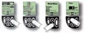
Figure 2. (click to enlarge) Smiths' insulin pump was created by talking with diabetics and their families and clinicians about what it is like to live with diabetes. This research revealed that the best insulin pump UI was likely to have features and use terms specifically tailored to what was uppermost in the mind of a diabetic when considering blood sugar therapy. However, it must also have features that make managing the disease fit into a diabetic lifestyle. To that end, the pump has a menu that includes items like pizza as a part of the programming routine (along with other programmable features such as swimming, walking, sleeping in late, etc.). |
When Pope's team was developing Smiths' new insulin pump, design research uncovered several alternative user interface approaches. Each of these approaches could have essentially become the personality of the product and shaped the way it served the user (see Figure 2). The design research performed by Smiths helped to categorize which features and functions users considered valuable. “We brainstormed the product concepts and took them back out to potential customers. We showed them things that they would not even have thought about had they not been able to see them. Therein lay the value of this approach.”
Getting Into Users' Future Mind-Set
This first part of the design research process is often just about listening, observing, and trying to become one with the way customers think. This phase can be as sophisticated as ethnographic research. But it can also be as simple as sending the design team out to visit working environments, walk trade shows, and attend conferences of potential users. Observation, structured interviews, group discussions, and casual chats may all play a part in helping the design team think like a user.
Consider a surgical product that has a UI on the control console. The product's development team is probably already in contact with the clinical trial participants. But they may also want to tour several regions of the country to observe similar procedures done by surgeons at different skill and experience levels. Doing so will be very revealing about broader market acceptance. It is often helpful to have prepared some simple storyboards to explain what the company is trying to do with a new product and its UI. But at this early stage, it is best to keep the ideas conceptual to keep feedback broad. Listen to opinions and influence them as little as possible. Try to chat with users in their workplace, which offers important contextual information.
It is wise to spread the net wide to gather feedback on future trends. It is also important to understand how a product fits into the overall therapy or diagnostic framework of hospital, office, or home environments. For instance, consider a product that delivers a drug therapy in the hospital wards. Nurses may actually program it, but it fits into a system that involves pharmacists, doctors, biomedical engineers who service it, and the broader policies of the hospital administration and IT departments.
All these stakeholders may be willing to discuss new product ideas and recount their woes in using existing products. They will be even more inclined to talk if the team makes it clear that they are listening, not selling. Meet with each group separately to avoid internal politics from obscuring the truth. If the team suspects that required practices are not always followed, follow-up any obfuscation with gentle, nonjudgmental queries to find out what is really done.
Patients who might use a device everyday are also often willing to talk. If thorough ethnographic work is not possible, consider employing simple techniques such as sending out diaries and disposable cameras a month ahead of an interview. When collected, such information provides a window into how a device fits into patients' lives.
Team members should not be lulled into thinking that because their company has been designing products in a particular medical area for 20 years that they understand their customers. Push customer contact all the way down into the design team. Send younger or new team members out with some of the old hands. Mix it up, and the results will be surprising and edifying.
Concept Generation
Concept generation begins with digesting the results of earlier field observations and brainstorming ideas for the new UI. The team may meet to discuss user requirements and attempt to reach a consensus on ranking them, since trade-offs are often inevitable in design.1 It may be helpful to find UI examples on existing products that epitomize what the team either strongly wants or does not want in the final product. Ask team members to bring their favorite UI examples to a brainstorming session. These need not be medical, or even have a screen and buttons. If possible, borrow or buy examples, as it is best for the team to actually experience the UI. If this is not possible, use images from the Internet or sales literature to explain the ideas. From these samples, a good debate usually flows: one person's simple is another's confusing.
UI designer Brad Rhodes, principal of EudesCo (San Francisco), a visual communications firm, explains that users' understanding of an interface is driven by five elements of involvement that all act in concert. According to Rhodes, the elements include the physical shape of the product and the feel of the controls (feedback, texture, etc.). Also included are the on-screen visual design and the interaction as they step through the process on-screen. Finally, any other nonscreen driven feedback, like force response, sounds, or other indicator lights or legends, are included.
Given the interrelation between features, it is best to brief the team well on the UI's objectives. However, consider having a number of people work outside the actual brainstorming session to create loose concepts for the group to consider. UI concepts are generally hard to sum up in the simple one-page sketches or snappy one-line descriptions typically generated in brainstorm sessions. A UI has to work on many levels and must have a coherent architecture. A UI is not just a screen-and-button layout. Rather, there must be a cognitive underpinning to the user interaction.
Create Concepts for Review
The goal of this phase is to create increasingly mature UI simulations. It should culminate with two or three different UI examples that end-users can test by actually playing with the simulations with as little intervention from a facilitator as possible. A number of tools can help teams convey the essence of the UI and highlight the most important aspects of the interaction experience.
Microsoft's PowerPoint or other slide show software provides a way to create storyboards with apparent interactivity for internal review before committing to fully interactive demos. Adobe Flash is a fast prototyping tool well suited to bringing concepts to life with button presses and changing graphics. Existing consumer handheld products (PDAs, iPods, etc.) can display screens via JPG or TIF graphics formats. This allows users to see the interface at its actual size. The images on the handheld should not be interactive; it does not usually produce a usable simulation. Instead, aim to show an interactive demonstration on a large-screen laptop with simulated buttons shown graphically around the display in the manner intended on the real product. Choose a screen size that allows users to focus on understanding the interaction between the elements without having to strain their vision or imagination. Even technophobic elderly patients usually manage to navigate their way around these kinds of demos using a mouse instead of pressing actual keys. It is also much easier to create the simulation this way.
It is important to understand the difference between the roles of two apparently similar graphical elements of UI design: interaction and visual design.
In the context of medical UIs, the interaction design governs how a user is able to move through the interface. If steps must be performed—for example, to deliver a therapy by setting up parameters or to carry out a diagnostic test at the correct time—then the way a product's UI moves a user through these steps is the interaction design. An interface should leave users feeling in charge of the product and should enable them to move efficiently through the steps. Successful UIs usually can do so because their interaction design requires the least amount of thinking, learning, and remembering to use. This is referred to as cognitive processing.
Interaction design may include metaphors to assist understanding (e.g., syringe or battery icons) or use pictures, animations, sounds, or speech to guide users to the goal. Many of these interaction elements are graphical. It is possible to treat them with different visual design approaches yet still have the same underlying interaction design. Given that ultimately the interaction and visual design merge in the users' minds to create the user experience, it is hard to separate them. In fact, the metaphors in some interaction designs require strong visual design to make them work effectively. For early concept testing, the interactive demonstrations should focus on several different approaches to interaction design, with minimal visual design to convey the intention. These relatively sparse UIs are sometimes referred to as wireframes.
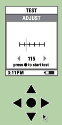
To present the visual design, a few sample screens should be worked up from each of the interaction concepts as finished-looking screens (see Figure 3). These screens can then be shown on the most appropriate platform at full size. If the product will be handheld, show the screens on a PDA screen. Allow users to move the PDA around to examine how the screens look, just as they would on the real product (see the sidebar, “Creating Early UI Concepts to Test in the Field”). If the screens are significantly larger, use a laptop or liquid-crystal display. If resources allow, explore several different approaches to the visual design of the various interface examples and see how users react. Only a few screens need to be visually designed to see how users react. If these were combined on the interactive demo, many screens would have to be visually refined.
|
Figure 3. This illustration shows how the interactive wireframe version of the UI might look on a laptop screen. The direction pad buttons mimic the use of buttons on an actual device. A test user mouse-clicks on the direction pad representation to navigate through the UI. |
Limitations and Opportunities of Software Development Tools
Writing software that will pass muster with FDA is a lengthy exercise. Writing software for UIs that have been poorly designed in relation to the hardware and software development tools takes even longer. Although it is beneficial to enter into design research with a good idea of the target hardware and software environments, they should not overly restrict the team.
The goal of design research is to find out what will make a product usable and appealing. Too many restrictions early on will limit opportunities. Consider showing black-and-white and color versions, and review graphically rich animated options alongside simpler concepts. Explore all kinds of trade-offs and be prepared to be surprised.
Research Subjects and Field Trip Preparations
While the team is preparing the props to take to users, someone needs to organize and recruit subjects for a field trip in which the concepts will be tested. If the U.S. market is the target, make sure that at least three geographically and culturally different regions are chosen. Obviously, if other regions of the world are important, include them. The good news is that relatively few users from each subgroup are needed to see how well the UI is working; a group of six people is usually sufficient. If any more people are involved, the returns diminish.
It is critical to think carefully about what constitutes a subgroup. If the product is surgical, the group should consist of more than just surgeons. The subgroups might be high-throughput practitioners, lower-volume thought leaders, and occasional users. With consumers, categories might be based on age or familiarity with similar technology or treatments, such as regular versus infrequent computer users, or potential versus experienced treatment users. The point is to pick a diverse but relevant set of groups to review the UIs. The team may not even know exactly how these groups might split in the market. Nevertheless, the act of categorizing these groups and meeting for feedback will be stimulating to the product marketers. Meeting with 25–50 users will provide good guidance at this stage. The second part of this article will address FDA's consideration of test methodologies.
The facilitator of the sessions plays a critical role. In addition to being impartial, the interviewer must have a deep understanding of the use context of the product. Good facilitators can run with interesting lines of questioning should the opportunity arise. For more tightly scheduled field trips, it is best to share this role between two people. Internal team members can perform this role if they have the right experience or aptitude. Otherwise, a professional facilitator is also worth considering for this job.
The process of taking ideas into the field and having a significant part of the team participating should not be underestimated. Team members that are exposed to the entire process hear directly what the customers are saying about the concepts. The customer interaction usually generates a lot of stimulation during the trip.
Conclusion
This article lays out the beginnings of the structured process for better understanding users and creating compelling UIs. The second part of the article will look at how to take these ideas back out to the field and turn the lessons from the feedback into the final UI specification. It is also about how to work the research and documentation into the FDA requirements for good human factors design.
The success of design research often comes from the significant involvement of many different team members in the field research that leads to some serendipitous realizations and breakthroughs. Getting out into the field as a small group can inspire vigorous debates based on new insights that day. This often leads to completely new ways of thinking about the problem.
For consumer UIs, improved usability has led to successful products. This result is likely to be reproduced in the medical arena in the next decade. The specialized nature of the products designed for the medical market means that OEMs have an opportunity to design their UIs to very specifically match the expectations of their users, even the first time they use a product. This will lead to some exciting opportunities for companies that take the time to understand their users. For users, it will mean spending more time focusing on the patients' needs instead of puzzling over prosaic programming.
Design Research Part 2: Refining User Interfaces
Bill Evans is founder and president of Bridge Design Inc. (San Francisco) and can be reached at [email protected].
Reference
1. Bill Evans and Jonathan Wyler, “Beyond Brainstorming” (Parts 1 and 2), Medical Device & Diagnostic Industry 26, nos. 9 and 10 (2004).
Copyright ©2007 Medical Device & Diagnostic Industry
About the Author(s)
You May Also Like