The Art of Screen Design: Part 1
Medical device manufacturers can greatly improve a device by investing in the visual style of its software user interface.
March 1, 2007
PRODUCT DEVELOPMENT INSIGHT
|
Wiklund |
In the medical device domain, an embedded software application's visual appeal is subordinate to its safety, functionality, and usability. Nonetheless, screen aesthetics play an important role in how people react to a device. Refined-looking screens can have a halo effect on quality perceptions, while primitive-looking screens can detract from the perception of quality. Therefore, device manufacturers usually have good cause to invest in software aesthetics (i.e., visual styling).
|
Kendler |
This is the first of a two-part article addressing how to make a software user interface visually appealing while remaining appropriate to its uses and use environment. This first part focuses on the role of visual appeal in a product's success. The article presents design techniques that can help achieve an appealing result, and it highlights a couple of exemplary designs. The second part, scheduled to appear in the April issue, discusses how software user interfaces can be styled to reinforce a company's brand identity. It also presents a development process that allows for stylistic exploration and innovation and explores how to choose a visual designer.
Currently, medical device software generally lags behind hardware in terms of aesthetics. For decades, in-house and consulting industrial designers have helped manufacturers develop refined-looking enclosures that parallel consumer products and thus garner design awards. Meanwhile, screen design has often been left to the programmers, few of whom would claim to be gifted visual designers. As a result, care environments are filled with medical devices—such as infusion pumps, dialysis machines, and patient monitors—that look great until you turn them on. Most clinical information management software that runs on desktop computers, as opposed to special-purpose devices, could use a facelift as well.
Fortunately, the tide is turning, partly because end-users have come to expect good user interface design based on their experiences with Web sites and business applications. In response, more manufacturers are engaging visual designers—who might also serve in the role of industrial designer or usability specialists—to add a touch of class to software screens. Assuming that a given software user interface is reasonably intuitive and meets functional requirements, the added touch of class can substantially improve a device's marketability and increase end-user satisfaction. In short, medical professionals are drawn to good-looking software.
The Role of Visual Style
An effective user interface allows users to perform desired tasks in an intuitive and efficient manner, which is accomplished through the implementation of a clear organization scheme, familiar terminology, and intuitive interaction mechanics. However, users develop an impression of a device's ease of use before they complete a single task with the software.
Screen aesthetics have a significant effect on users' first impressions and have the potential to set users' expectations for the rest of their interactions with the product. A poor first impression can lower users' trust in the device, or lower their motivation to use it, whereas a positive first impression can increase users' eagerness to use the device and provide them with a more positive experience.
Visual style also communicates the software's personality and sets users' expectations for the product. Screen aesthetics can make a device seem warm and friendly, cool and business-like, or traditional and scientific. A particular style's appropriateness depends on the nature of the device and its users. For example, lab technicians might appreciate a more serious and scientific appearance in a blood analysis workstation, whereas nurses might expect a friendly, nonintimidating appearance in a handheld blood testing device. Similarly, nonclinical users of medical devices, such as patients and their assistants, would likely seek even simpler and more consumer-like visual styles than clinical users.
Designers have the means to create myriad visual styles and personalities through the manipulation of visual design elements. This is equally true in both devices with large color displays and devices with small monochrome liquid-crystal displays.
Visual Appeal
|
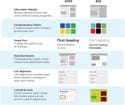
(click to enlarge) Although device users' tastes may differ, there are a few rules of thumb to follow when designing a screen that will be user-friendly. |
It has been said that matters of taste are infinitely debatable, which automatically complicates any discussion of visual appeal. But reasonable people can usually agree on whether a software user interface has appeal. Screens with the following traits usually elicit favorable responses from users.
Moderate Information Density. People generally dislike overly sparse or crowded-looking screens, preferring screens that are about one-third to two-thirds filled with content (e.g., blocks of text and graphics). That said, they will accept a more crowded screen, particularly regarding devices with small displays (e.g., a pulse oximeter with a 320 × 240-pixel display), if it prevents having to distribute related content across two or more screens.
Harmonious and Limited Number of Colors. Just as shirts, ties, and suits of a particular color match up, screen elements (e.g., background fills, headings, and icons) of a certain color also go well together. Typically, visual designers like to work with a small number (three to five) of colors that complement each other, or contrast in a desirable fashion. To add visual variety without creating visual complexity, designers frequently utilize multiple shades of the same color (e.g., light, medium, and dark blue). As such, designers might work with a set of pastel, jewel tone, earth tone, or similarly well-matched colors. People particularly like color combinations found in nature, such as lighter blues, yellows, and grays.1 For this reason, a screen with a lightly colored or gray background will generally look more pleasing than one with a white, black, or highly saturated color background. A monochrome display might serve its function well, as exhibited by some portable patient monitors, but lack visual appeal. It will be viewed as “old technology” by people accustomed to seeing color displays on even inexpensive consumer products, such as point-and-shoot cameras and printers.
Limited Number of Fonts. Screen designs that employ more than a couple of font styles start to look like visually chaotic ransom notes. Sticking to one or two fonts, with consistent use of bolding and size differentiations, cuts down on the chaos and opens the door to other stylistic touches. Fonts also contribute to the personality of the screen design: serif fonts, such as Times New Roman and Palatino, create a more traditional appearance, whereas sans serif fonts, such as Helvetica and Frutiger, confer a more modern feel. Additional font qualities, such as the roundness and boldness of characters can contribute to the apparent friendliness and clarity of the design.
Balanced, Asymmetrical Composition. Just as people can be disturbed by a crooked picture on a wall, they also can be troubled by an imbalanced screen with more content on one side than the other. Therefore, lacking a compelling reason to shift more on-screen content to one side, it should be fairly evenly distributed. However, designers should avoid making screens look perfectly symmetrical because such compositions can appear rigid and boring. The rule of thirds suggests composing screens so that (a) the primary visual elements rest at the intersection points of a 3 × 3 grid superimposed on the screen, or (b) dominant horizontal or vertical components align with the grid lines.2
|
(click to enlarge) Certain screen effects can elicit favorable responses from users. These effects will vary, however, depending on who the end-user will be. |
Proportional Sizing. Although most people might not be aware of it, they are pleased by visual elements whose proportions are mathematically related. For example, they like small buttons that are one-half the width and height of large ones, rather than an odd fraction thereof. Similarly, they like screens to be divided into portions that have a common element, such as a 200-pixel-high by 200-pixel-wide block. By comparison, they dislike filled areas and pop-ups that have slightly different heights and widths that suggest inattention to detail. The exception might be objects sized according to the golden ratio (also called the golden section or divine proportion) of 1.62:1.2
Consistent Alignment. People dislike misaligned elements and are pleased when things line up in vertical and horizontal rows. Left alignment complements a Westerner's visual scanning pattern while centering sometimes looks more balanced but is harder to scan. Therefore, most visual designers choose to left align text blocks and graphics. Conflicting with an earlier guideline, this might cause a particular screen to look asymmetric, but will give a collection of screens a more unified, pleasing appearance. However, reading errors can arise when numbers with a varying number of decimal places (e.g., 300, 20.6, 0.375) are either right or left aligned. Decimal-point alignment is usually less prone to reading errors.
Limited Complexities. A simple-looking screen provides an appropriate background on which to place a comparatively complex visual element. The overall composition works nicely because users are not overwhelmed with complexity. Rather, they can focus their attention on a single complex element because nothing else competes for attention.
Logical Ordering. Particularly with regard to screen layout and typography, people like to see visual elements ordered in terms of visual dominance, which, in turn, infers an order of importance. Westerners are accustomed to a top-to-bottom and left-to-right order within groups of information and across an entire screen. This suggests placing the most important element in the upper left corner of a screen and the least important one in the bottom right corner of a cluster or overall screen. However, by convention, people look to the bottom right corner for elements like an “OK” or a “Continue” button. Also, studies show that people tend to overlook a screen's upper right corner. So, there are important exceptions to this rule.
Consistent Spacing. Spacing visual elements consistently almost always improves a screen's attractiveness. Accordingly, a designer might leave a 20-pixel gap (also called a gutter, or padding, depending on whether the space is on the screen's edge or interior, respectively) between primary visual elements, and a 10-pixel gap between secondary ones. Like other visual inconsistencies, haphazard spacing results in a sloppy appearance.
Balanced Use of Text and Graphics. Perhaps because of cognitive laziness, but also because of the human eye's attraction to images over text, graphics add considerably to screen appeal. However, in a medical context, the graphic must be useful or it will be criticized as gratuitous and extraneous. The nature of various graphics in medical applications makes it hard to state the optimal proportional mix of text and graphics, but a ratio ranging from 5:1 to 3:1 is likely to please. But the general rule is to employ graphics where they enhance communication and appeal, noting that images are usually more memorable than text. The challenge is to produce visually appealing graphics that are also meaningful.
Refined Graphics. The term graphic evokes images ranging from a virtual pumping heart to a trend graph to an iconic label. Depending on the level of design refinement, such elements might cement or erode an application's overall appeal. They are more appealing if the designers develop them as an integrated set, employing a common visual style. An appealing set will share a harmonious color palette (as discussed earlier), similar line weight, and an equivalent level of abstraction and detail. They might also be tied together by a common element, such as a gradient background or fill.
Information Coding. People like intuitive and conventional coding schemes. For example, most people like it when alarm information appears in a window differentiated by a bold red or yellow header, as opposed to a black one. It helps them immediately recognize the information's importance, with red and yellow representing high- and low-priority alarms, respectively. So, while the alarm may be cause for concern, the ease of recognition is pleasing at a conscious or subconscious level.
Functional Grouping. Placing information and controls in function-related groups is a core human factors principle that improves software user interface usability. However, functional grouping also adds visual appeal by simplifying the screen layout. People generally prefer to view screen elements in a logical arrangement that facilitates rapid scanning and makes it easier to remember where things are located. If the layout is not logical, users are left to scan a collection of content that is without visual distinction, which can be fatiguing.
Softened Objects. People usually prefer slightly rounded objects to those with sharp edges. As such, they are particularly fond of buttons with rounded (i.e., radiused) edges and corners, anti-aliased letterforms, and gradient backgrounds. However, excessive use of organic shapes and textures can create a muddled appearance that makes information difficult to scan.
Three-Dimensional Effects. People respond positively to screens with a three-dimensional (3-D) appearance, which can be created by objects (e.g., buttons, scrolling lists, icons) with beveled and highlighted edges as well as overlapping surfaces (i.e., layers). In addition to bolstering aesthetics, these effects differentiate objects— particularly touchable or clickable objects—from their backgrounds by making them easier to spot. However, excessive use of 3-D effects in conjunction with decorative or noninteractive screen elements can clutter a design and ultimately complicate user interactions.
Constrained Special Effects. Although some special effects, such as the simulation of fluid flow through a tube, can be visually compelling, overly primitive or flashy effects can be off-putting because they look cartoon-like and distracting. Also, an excessive number of special effects can evoke video games; an impression incompatible with professionally designed software. When designers use a limited number of special effects to enhance communication rather than to decorate, the end result is usually more pleasing.
Exemplary Designs
Having discussed the mechanics of producing aesthetic screens, it is helpful to take a look at a couple of exemplary designs that pull it all together.
|
|
(click to enlarge) The muted background on the Pascal photocoagulator by OptiMedica enables black and red elements, such as icons, to stand out. Photos courtesy of OUT OF THE BLUE DESIGN |
The Pascal photocoagulator by OptiMedica is used by ophthalmologists to treat a range of retinal diseases, including diabetic retinopathy, by means of patterned laser pulses. The product's primary touch screen presents the physician with multiple controls to set up and deliver the therapy. The largely monochromatic user interface design contains a muted background against which black and red visual elements (e.g., icons, amplitude indications, and a warning) stand out. The screen's touch targets are differentiated by both gradient fills and shading that combine to create a three-dimensional appearance. Although the sample screen incorporates numerous visual elements, their functional grouping and spacing help prevent visual congestion.
|
(click to enlarge) The touch screen interface on the Medrad Stellant D is a simple-looking and easy-to-read layout. |
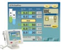
Medrad's Stellant D touch screen– based user interface allows CT technicians to control, monitor, and review contrast medium injections. The interface's grid-based arrangement and large numeric values create a simple-looking and easy-to-read layout. Adding to the simple appearance is the muted background that creates a calming appearance, while patches of more-saturated colors bring attention to critical values and touch targets. Diagrams of the injector's syringes create an appealing and easy-to-scan representation of the injection's progress. In short, the screens project a professional and attractive style that enhances, rather than interferes with, the design's functionality.
Conclusion
Undeniably, people prefer pleasing visuals to those that look disheveled, chaotic, or messy. Therefore, medical device sales can ride on software appearance if the end-users, and not just the budget managers, are involved in the decision to invest in appearance.
Ideally, a company that invests in screen aesthetics will have already taken steps to ensure that its software applications are functional, effective, and usable, thereby reflecting a total commitment to quality. Otherwise, a more fundamental change in the company's design process is in order.
As discussed in the second installment of this two-part article, some companies will need to adjust their product development process to ensure the creation of attractive software user interfaces, as well as find qualified people, be they in-house staff members or consultants, to perform the hands-on work.
Michael Wiklund is founder and president of Wiklund Research & Design Inc. (Concord, MA). Jonathan Kendler is a cofounder and partner of the firm. The authors can be contacted through www.wiklundrd.com.
References
1. E Tufte, Envisioning Information, (Cheshire, CT: Graphics Press, 1990).
2. W Lidwell, K Holden, and J Butler, Universal Design Principles, (Gloucester, MA: Rockport Publishers, 2003).
Copyright ©2007 Medical Device & Diagnostic Industry
About the Author(s)
You May Also Like


