Delivering Positive Medical Experience Through Color
Specialists use market research and color psychology to help companies successfully use color as a powerful design tool. That research can be applied to create successful medical devices.
January 9, 2017

Specialists use market research and color psychology to help companies successfully use color as a powerful design tool. That research can be applied to create successful medical devices.
Hours and hours of sweat and tears go into designing and developing a medical device. But when it's time to choose a color, companies have no clue what it should be. So they guess and hope for the best.
That's too bad.
The potential to use colour to increase market acceptance, establish brand identity, optimize usability, and raise patient comfort is lost.
The truth is, many industrial design schools do not include color design as part of the curriculum. Many designers lack the understanding to make a confident colour decision. I was introduced to the world of CMF (color, material, and finish) design while working with the specialists during my employment at Belkin designing iPod/iPhone accessories. CMF specialists use market research and color psychology to help companies successfully use color as a powerful design tool. The same impact can be applied to create successful medical devices.
Here, we will explore how color can make medical devices more intuitive to use and increase workflow efficiency and user confidence. Usability can be enhanced through color design that organizes and directs the user's eye flow. Color can also deliver a positive medical experience by reducing anxiety or other negative feelings and inspiring a desired emotional response from the user.
Colors Make Products Easier and More Intuitive to Use
Organization Through Color Coding
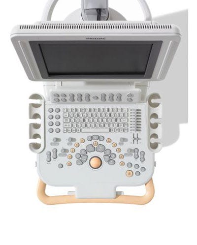
Color can group related functions and provide a system of organization by defining different areas of function and importance. For example, the interactive components of this ultrasound machine from Philips Healthcare are well organized by placement and use of orange and different tones of gray. The gray buttons and knobs that the user interacts with are immediately highlighted against the light gray background due to contrast. On the other hand, the keyboard is the same color as the background and blends in. The orange-colored buttons and the trackball calls attention to those features, since the unique orange color signifies a unique function to the user. Grouping of the buttons, knobs, and sliders based on hierarchy of function and frequency of use does not solely rely on location--color plays an important part in neatly tying them together.

Eye Flow/Direction
Color directs the eye through a hierarchy of information. It is useful on devices that require multiple steps. Contrast naturally attracts attention. On the Omron 7 Series Blood Pressure Monitor, a highly saturated blue against white instantly directs the user's eye orientation to the "Start" button.
Next, the user's eye orientation is guided to the gray box (containing the buttons and the display screen) and it rests there. The switch that allows the device to be used by two users is left out of the gray box on purpose. It is not used as frequently as other buttons.

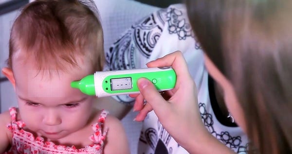
Another example is the Koogeek Forehead and Ear Thermometer. The bright green stands out against the white background of the body of the device. It keeps the user's attention to the pointy part that is held to the ear or forehead and within the borders of the green color. The display and the important start and power buttons are inside the green. The two other buttons outside of the green border are used less often. They allow the user to alternate between the forehead and ear mode, so these buttons are not necessarily used each time the device is used. The elongated green color block also makes the device look slimmer.

Cleanliness
Another usability aspect of color is the affect it has on cleanliness. White, light gray, or light neutral colors show dirt more noticeably. This prompts staff to clean the device thoroughly and keep it clean.
Dark colors hide dirt better. Casters, foot pedals, the base of floor-standing products, pushbars on carts, and other areas with frequent use are generally in darker colors to conceal dirt and scuff marks.
Influencing the patient/user's emotional response
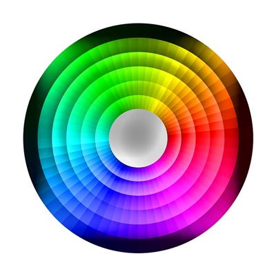
The hue (what we usually refer to as "color") you use, amount of saturation (color's intensity), and value (color's brightness/darkness) have a profound effect on the user's emotions. Which emotion should the product communicate to its user? Is your device for use by surgeons? Should the color project confidence?
Is your device for use on a patient undergoing an uncomfortable procedure? The color should help the patient feel relaxed. Or is the device for use by a patient with a chronic condition? Perhaps the color should convey optimism or empathy. The power of color can be used to make a statement you want to communicate to the user.
Hues
Different hues trigger certain thoughts and emotions. The chart shows a small sample of how some colors can evoke positive and negative feelings. The context of the situation and the setting a device is used in both play important roles in how the color will be received. Black applied on a handheld electronic medical device designed for home use will help it blend in with other consumer electronics at home. The black will help the device look high tech and classy.
However, a large black ultrasound cart sitting in an examination room might make the ambience of the room seem very solemn as black is negatively associated with death. In the same situation, if the black was used sparingly on just the base of the ultrasound cart, it could make the cart look more anchored and secure.

In general, warm colors display energy, action, youthfulness, and happiness. Hues of yellow and orange are good for devices used in rehabilitation and pediatric fields. However, in the medical device industry, red is generally reserved for warning signs and stop buttons because the intensity of the color can cause a feeling of alarm (not good if you want patients to be at ease) and attracts visual attention, making the stop button easy to spot.
Cool colors are generally perceived to be relaxing, and cool in temperature. Hence, their popularity in hospital settings for their tranquil characteristics. However, the trend is shifting away from using blue-greens in hospitals as people are tired of the over-use of those colors.
An example of poor use of cool colors would be on devices that are cold to touch, as the color will accentuate the perceived cold sensation.
Saturation: Color's Intensity
Highly saturated hues are bold and vibrant. Colors in low saturation are muted. Muted colors are great for hospital settings since they are perceived to be soft and help reduce tension. High saturation colors display energy. They are perceived to be loud.
Value: Lightness or Darkness of a Color
Low (dark) value colors are closer to black. High (light) value colors are closer to white. Low value colors look heavier in weight compared to high value colors. For this reason, they are used at the base of devices to give the impression of being secure. On the other hand, high value colors are used on large floor-standing equipment so the equipment does not overpower the use environment with its perceived weight.
High value colors also imply purity and cleanliness, traits that are applicable in hospital settings. Keep in mind that very low value color placed against a very high value color will create a contrast. Contrast is great way to draw visual attention.
The color of a device can influence how the healthcare provider or patient feels about the overall experience of a medical procedure. By employing the right hue, saturation, and value, you can harness the power of color to organize user interface components, direct eye flow to making devices more intuitive to use, and impact the emotional response of users to encourage a desired effect.
[Images courtesy of 422737/PIXABAY, PHILIPS HEALTHCARE, OMRON HEALTHCARE, KOOGEEK, and PETELINFORTH/PIXABAY]
About the Author(s)
You May Also Like

.png?width=300&auto=webp&quality=80&disable=upscale)
