
Sign up for the QMED & MD+DI Daily newsletter.
PRODUCT DEVELOPMENT INSIGHT
Bill Evans
July 1, 2007
17 Min Read
.svg?width=850&auto=webp&quality=95&format=jpg&disable=upscale "Design Research Part 2: Refining User Interfaces")
PRODUCT DEVELOPMENT INSIGHT
New technology is the driving force behind many innovative medical products. But often, the opportunities created by technology also require increasingly sophisticated user interfaces (UIs). This challenges the design team to create the most usable product possible. This is the second of a two-part article that explains how a creative process driven by design research is critical to product usability. This approach can apply to ergonomic challenges, such as establishing the best handpiece for a new surgical tool. However, this article focuses on graphical UI challenges. The first article, published in the May issue of MD&DI, described how to conduct the initial part of the design research and how to use what is learned as a stimulus to create a number of ideas. The next step is to take these ideas back into the field and turn the feedback into the final UI specification. It is also necessary to consider FDA requirements for research and documentation for good human factors design.
Taking Concepts Back to Users
The lessons that can be learned from taking the preliminary ideas back out in the field are somewhat unpredictable. However, learning about the unpredictability is the point.
Product developers who are immersed in the intricacies of their new product ideas like to think they have a good gut feeling of what users will prefer. Users, of course, often see it differently and have a way of surprising designers. It's much better to discover these differences early, with inexpensively produced mock-ups, storyboards, and interactive demos, than to take ill-conceived ideas all the way through to commercialization.
Mike Higgins, PhD, senior director of program management at Pelikan Technologies (Palo Alto, CA), recently managed a project to create a UI for a handheld patient-monitoring device that uses his company's novel blood sampling and measurement techniques. “We employed user research to make design decisions that are based on data rather than on opinion,” he says. “User research allowed us to measure the fit between design alternatives.” And what he learned in the field brought some surprises. “Our chief design goal was simplicity. The surprising finding of our user research is that what we thought was a simple user flow was not always the case.” He believes that if the company had not conducted user studies, the device would have been safe—but usability problems would not have been discovered until the device was in the marketplace.
There are strategies to structure the feedback-gathering exercise so that it elicits some of the more subtle responses. Let's say some kind of patient monitor is being developed. Its main function is displaying instantaneously the value of vital signs. New technology has created an opportunity to add value to the way the information is presented. For instance, trending, event logging, or sophisticated signal processing could all be used to present data that could improve patient care to healthcare professionals. Before they actually see the concepts, users may say that trending is of low interest. But when users see what the trending looks like on a mock-up and realize that new ways have been created to analyze the data, they may change their priorities. They may be able to revise how they would interact with the product if it had this feature. Of course, the research may also show that features that seemed like good ideas to a development team do not appeal to users.
A typical UI test setup consists of a laptop and two video cameras. One captures the general view of the user and facilitator, and the other looks over the shoulder of the users as they attempt to navigate the UI. After a brief, nonleading introduction to explain the context of the product being tested, the UI interaction can begin. (It is also a good idea to use the introduction to probe users about what is on their minds as they carry out the therapeutic or diagnostic routine.)
As described in the previous article, it is best to create two sets of props on which users can comment. A functioning, interactive mock-up can be created that will run on a laptop computer. It focuses on the interaction design aspects of the interface (button presses are usually replaced with mouse clicks). Typically, this UI mock-up is presented larger than full size, so that users can focus on functionality rather than legibility. Doing so also makes the buttons larger and, therefore, easier to press with a mouse. A second prop consists of a few sample screens that are presented at the final intended size, either on a handheld product like a PDA or on a laptop. These screens should have a more refined visual design to enable feedback on the appearance of the display; however, they should not be interactive.
|
|
|
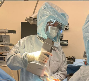
As the UI is implemented into the preproduction product, expect to do comprehensive user testing in situations and with users that closely mimic the intended environment. This lab records participants' faces as well as what they are doing on the equipment to get a 360° view of the users' interaction with the product. Photo courtesy of the Healthcare Human Factors Group, University Health Network (Toronto, ON, Canada). |
Using the first prop, tell users only basic information, such as how to press buttons with the computer mouse rather than with their fingers, and see how they do when they try it. Initially, say nothing. See how far they get and note their comments. Ask them to report what they are looking at before or after important transitions in the UI. Ask them to report the on-screen data or what the screen is showing, for example. As they explore more, ask them to execute tasks such as finding the hourly trend graph or setting an alarm condition. These questions will quickly reveal how well or poorly the interaction is working.
Once the interactive portion of the test is completed, show users a more-refined visual design of the UI at full size. Again, listen for comments and observe before prompting the users about the specifics of what they are looking at.
Because more than one idea will be shown to users, it is important to vary the order in which examples are shown. When users are naive about the UI, first impressions are critical. Try to show each UI example first an equal number of times to the various subgroups of potential users. Do not just randomly mix the starting idea.
The ideas shown should span a wide variety of possibilities, and the observers should watch how users respond. Prepare to be surprised and to listen hard when it does not go the way you expected. Rhall Pope, vice president of R&D at Smiths Medical (St. Paul, MN) has learned to expect the unexpected on UI development projects. “Some of the more advanced ideas we have shown proved difficult for our potential customers to connect with,” he explains. “You try to probe further to find out why a feature that looked like it was addressing one of their articulated desires is not connecting.”
Acting on the Feedback
When a team reconvenes to consider what it has learned, it will usually find that one of the concepts has quickly risen to the top. But often the others have aspects worthy of inclusion. For instance, one of the interaction designs may have been the best received, but users may have preferred a different emphasis or order of information shown. The visual designs that were reviewed may have a clear favorite. But the review may also have shown which visual elements were communicative, which were confusing, or which were disliked for aesthetic reasons. It is also likely that examining how users navigated through the UI (unprompted by the facilitator) will expose places where it is not working well. From all these qualitative data come clear directives that can be passed along to a smaller subset of the team that will refine the chosen UI concept.
The interaction design and visual design must be refined together. When combined well, the UI may not really require a user manual (although one will, of course, have to be created). UI designer Brad Rhodes, principal of EudesCo, a visual communications firm based in San Francisco, notes, “Either a user understands how to use a product prima facie or learns through doing and interacting with it. The visual design should facilitate this learning either way.”
Depending on how much a final concept varies from an initial one, it may be wise to take an interactive version of the final concept back into the field before software coding begins in earnest. This UI test might go to a more limited number of users, such as a particular subgroup of the original group that found the first concepts harder to understand.
UI Refinement and Full Specification Creation
The final specification to pass to the software team should chart the user flow diagrams. These diagrams describe the interaction and how the visual and sound assets fit into them. It is usually a fairly lengthy document. It should be illustrated heavily with the intended graphics, rather than simply referencing a long list of graphic files. If possible, a final interactive demo should be created; it does not need to cover the entire system flow—it should just give a flavor of the UI. Such a demo can be useful to show senior management to get sign-off on the chosen UI. In addition, expect to continue designing even during the final specification documentation phase. “There are always some surprises late in the process as you are figuring out all of the little details,” says Rhodes. “Assuming the designers have done their job well creating a visual language, the refinements or variations should come easily. It's just a matter of extending or applying the language further to meet the need.”
A Sample UI Development
Sidebar: |
What follows is a UI development plan that takes into account FDA requirements for UI development (see the sidebar, “FDA and UI Development”). It focuses on tasks and challenges faced in the early stages of development. These stages begin prior to concept creation; span concept creation, development, and testing; and continue through concept refinement.
Prior to Concept Creation. Before you create actual interface concepts, stand back from the product. Bring in someone familiar with the clinical issues. That person should consider not just the obvious intended use, but also possible errors, their potential effects, and suggested ways to mitigate them. This can be done before a button layout or even a display type is chosen. This big-picture view of possible hazards will help point out traps to avoid later.
This is also the stage at which immersing the team in the environment and concerns of the users is invaluable. Doing so can help the team catch some of the subtler errors that might otherwise only be exposed very close to market release. For example, a product may display a vital-sign parameter for use in an ER environment. Taken on its own, a design team may not have considered the color of certain data important (notwithstanding the usual concerns about red, green, and amber). The design research may have exposed that the equipment is likely to be used in conjunction with other vital-sign monitors. Confusion could arise if a monitor from some other medical device typically displays a number similar in value to yours in, for example, the color yellow. And confusion between these values might lead to a bad clinical decision. This concern could be logged into an early hazard analysis, alerting the team to this potential confusion and suggesting that the concepts aim to mitigate it.
Another common concern is the location and shape of on-off switches in relation to start-stop functions on a product. The start-stop function may relate strongly to a programming screen. Meanwhile, the on-off switch may be considered a must-have requirement that does not relate to the display. But if a user confuses these two buttons, perhaps because of proximity or ambiguous legends, then an error could occur. For example, the final button press on a UI might be to initiate the dosing of a lifesaving drug with the start-stop button, saying “Press start to begin treatment” onscreen. A nurse less familiar with the device might mistakenly press the on-off button to start the treatment, toggling the pump off. Distracted by another emergency, the nurse might fail to notice the screen asking for confirmation to turn off the pump, and walk away from the device leaving the pump, the dose, and the patient hanging. Devices have been recalled from the market as a direct result of simple button-placement errors like this. Once the design team understands this possibility, it is much easier to design around it to minimize the likelihood of errors.
Concept Development. During the concept development phase, focus on hazard mitigation. The customer requirement goals and the desire to make the UI as intuitive as possible are pressing concerns at this stage. In addition, the team should consider specifically how it will mitigate the issues exposed by preliminary review of potential errors. Also, plan the props that will be used in initial field testing to give a better understanding of how well the mitigation strategies are working.
Preliminary Concept Testing. The design research approach recommends taking two or three concepts out to potential users to elicit feedback. It is not necessary to exhaustively test every button press or draw up a detailed failure modes and effects analysis (FMEA) of these concepts. This is the beginning of a discovery process that has many checks and balances built into it. The goal in early concept testing is to catch the large potential errors and establish which UI works best for potential customers. However, it is important to test the parts of the UI for which the team has identified potential hazards and see whether the approaches to mitigation are working. Using the example cited earlier of the color of the display, the team may test the concepts as follows.
Expose users to a data display of various colors that are deliberately different from other equipment. Note how accurately the numbers are read. After an initial response, the facilitator might show the subjects examples of numeric displays on the test UI in scenarios adjacent to other equipment. (In that case, it is suspected there may be an ambiguity.) Again, take note of how accurately the numbers are read and of any user comments. Finally, the facilitator might ask the users whether there was a possibility of confusing the test product's data display with any other equipment. Note that this leading question should be left until last to avoid biasing the earlier tests.
It's also important to note that once the UI is fully implemented on the final product, it must be demonstrated that real users are able to perform tasks safely as intended in a working environment that simulates the real thing. In preliminary testing, as few as six users of a particular kind (e.g., doctors, nurses, elderly or young patients, etc.) will give an excellent sense of how the UI is working. However, a statistically significant number of users will have to participate in the premarket validation studies (20–50 or more, depending on the product). In those studies, the UI will be tested on the actual product rather than on a simulation.
From FDA's perspective, the analysis and preliminary testing that are done in design research are early forms of verification. FDA defines verification as “confirmation by examination and provision of objective evidence that specified requirements have been fulfilled.”1 In other words, the UI must be analyzed based on previous experience of what makes for a good interface in the use environment. (This is sometimes referred to as a heuristic analysis.) From this initial verification work, the development team will be in a good position to choose the best concept.
Choosing the Concept to Refine. Review the field test findings in parallel with the team's early hazard analysis. From the findings, it is possible to judge which interface approach is most intuitive and helpful to users, as well as which deals with potential errors best. However, the more usable interface still may not address all the errors that have been identified. Before choosing a concept to refine, try to resolve those issues, advises Robert North, PhD. North is chief scientist of Human Centered Strategies (Colorado Springs, CO). “It may be that preliminary testing or early prototype concepts do not adequately demonstrate that you're going in the right direction, or the risk analysis may show a remaining problem area regarding potential use error,” he says. In those cases, a team should resolve those issues in simple early- concept models before launching the software development process.
The more serious potential problems may need further design iterations before moving on. If less-serious issues remain unsolved, the team can still move the project forward to refinement with the understanding that it still has some potential errors. The important thing is to log these hazards, create a plan for how they will be mitigated, and test those mitigations as the project moves forward. For example, testing may have shown that one of the concepts was the strongest in terms of usability, but that deeper into its layers of interaction, users had some problems setting and understanding some alarm conditions. The team cannot solve everything all at once. “Knowing where you're heading in terms of increasingly tighter and tighter validation is good,” North notes. “Just remember to keep the analysis at an appropriate level for where you are in the conceptualization process.”
Overview of the Remaining Stages. Once the team completes the design specification, considering risk management as well as usability, the actual product software is written. The software should combine the human interaction flows and the visual assets into a working UI. Once integrated, the product can move to more-specific usability testing. Such testing is governed by maturing design-control documentation that includes detailed FMEAs and a rigorous task-analysis process. “This involves documenting the user steps through the UI, whether normal or emergency interactions, that dig as deep into the interaction as the team sees as relevant to this analysis,” explains North. “For every action in the task analysis, even if it is not something you observe, use errors should be postulated as ‘what-if' statements regarding the inability of the user to sense and process information or carry out an action.”
Next, a plan should be devised that will test the UI generally and probe for potential errors uncovered in the task analysis. The tests should be performed in as close to a real-world situation as possible. This testing will almost always expose design issues; they cannot all be eliminated. FDA allows for many ways to mitigate such issues, including labeling, user training, or simply tracking actual occurrences after market launch. The method chosen depends on the severity of the error and the ease with which an error can be designed out (rather than being mitigated).
The key to meeting FDA requirements is to have a good process. “The scenario you are trying to avoid is having a device go to market and without all the use errors being identified, or having a process for doing so,” says North. Then, if the device causes harm to a patient because of a human interaction or use error, FDA will ask to see the process by which the design team might have identified this error. And if you can't show the agency your process, your process will be in question, he says.
Conclusion
The least expensive time to design quality into and errors out of a product is during the early concept generation stages. The simulation tools and design research method described in this article are a cost-effective and quick way to start a UI project on the right footing, before software coding begins in earnest. The key to this approach is not just about listening to users. Rather it's about how a development team creatively incorporates users into the design innovation process. Users will not tell you how to create the next-generation medical UI. The process is not going to be purely scientific—you still have to rely on your experience and knowledge.
Bill Evans is president of Bridge Design (San Francisco). He can be reached at [email protected].
Reference
1. Code of Federal Regulations, 21 CFR 820.3.
Copyright ©2007 Medical Device & Diagnostic Industry
About the Author(s)
You May Also Like