Good software user interface aesthetics can reinforce for a user that the device is professional, innovative, and high quality.
April 1, 2007
PRODUCT DEVELOPMENT INSIGHT
|
Wiklund |
Ask a caregiver if software user interface aesthetics matter and you might hear a resounding “No!” But opinion researchers know that a person's stated view does not always match his or her behavior. In truth, caregivers are drawn to attractive screens not only for aesthetic reasons, but also because good looks imply overall quality. Therefore, appearance can have a powerful effect on purchase decisions and user satisfaction.
|
Kendler |
This is the second of a two-part article about making software user interfaces visually appealing while keeping them appropriate to their use environments.
The first installment, which appeared in the March issue of MD&DI, focused on the role of visual appeal in a product's success. It described design techniques to achieve an appealing result and presented a couple of exemplary designs. This installment discusses how software user interfaces can be styled to reinforce a company's brand identity. This development process allows for stylistic exploration and innovation. In addition, it is important to know how to choose a good visual designer.
As discussed in the first article, producing an attractive software user interface is challenging, given the many competing design goals to address. For example, screen designers must figure out how to fit plenty of information on a main screen without creating a congested appearance. But most companies also want their products to have a branded appearance and fresh look that suggests innovation. These parallel challenges call for a special mix of visual design skill and medical domain experience.
Branding
The most common approach to branding a software user interface is to bathe screens in the colors found in the company's logo. This is why Coca Cola's Web site is bathed in red, John Deere's is quite green, and UPS's celebrates the color brown.
Therefore, it makes sense for medical companies to follow suit in lieu of another basis for color selection. The problem is, few medical companies truly own a particular color the way the consumer product makers mentioned do. Also, a product that is too flashy or draws undue attention to itself or its manufacturer may offend some caregivers. Generally, caregivers prefer conservative designs. That preference weighs against software user interfaces that employ flashy, saturated colors and showy graphics, such as those found on many consumer product Web sites.
Caregivers speaking in individual and group interviews usually request that software user interfaces look simple, clean, and professional. The interfaces should project high quality but not be too colorful. They think color should be reserved to communicate critical information. They want designs that attract their eye to the most important information (e.g., heart rate and oxygenation level) when viewed from across a patient's room, for example. This explains why so many medical software user interfaces employ a blue and gray palette that one might associate with a conservative high-technology firm. As such, the goals of corporate branding and meeting user preferences are often served by the same design.
When available, corporate branding guidelines for printed materials serve as a good starting point for branding a user interface. However, guidelines for print materials tend to include decorative elements that can enhance the appeal of brochures and presentations. Those same elements might detract from the appeal of a graphical user interface. As such, branding guidelines for user interfaces can be developed as a subset of the corporate branding guidelines.
|
Figure 1. (click to enlarge) A user interface can inherit primary design elements from a company's logo or printed materials, but it should allow for exceptions that can benefit the screen's design and usability. |
In other words, they can inherit primary design elements while allowing for exceptions that can benefit the usability and appeal of the screen design (see Figure 1). A few basic methods for achieving this can include subdued colors, fewer decorations, etc.
Innovation
Caregivers often state a preference for the designs to which they have become accustomed. This goes a long way toward explaining their preference for conservative solutions. Consequently, designers who develop user interfaces matching the users' stated preferences are likely to produce a familiar me-too or derivative product that does not reflect progress. This poses a conundrum for designers who wish to innovate for the sake of brand differentiation and real progress in terms of visual appeal and interactive quality, but fear stepping outside the bounds of market acceptability.
The safe strategy is to develop a range of concepts and then test them with prospective users to determine which strategy is most preferred. Still, successful innovation typically requires manufacturers and their designers to take the informed risk of producing designs that users will come to appreciate in the near future, if not the present. Automobile designers do this all the time, producing trend-setting models that take time for people to fully embrace. For example, Audi took a chance by giving its cars larger, arguably gaping grilles that some consumers considered overwrought. But the look has caught on with the general public. Similarly, a user interface design shift from text-heavy screens to those dominated by icons might put off some users initially yet ultimately gain wide acceptance.
Development Process
Hardware designers are accustomed to creating a wide range of design concepts in sketch form, refining 5–10 of the better ones. From there, they build models (i.e., prototypes) of the 3–5 concepts most preferred by the in-house staff, and then engage prospective customers to determine which of the models should be developed further. This process also works well for software user interface design.
|
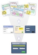
Figure 2. (click to enlarge) A screen design will usually begin as many sketches that are refined based on user input. |
The design team, or a broader committee of in-house developers, can usually whittle dozens of sketches down to 5–10 with the most promise. Sketches may be produced by hand or by computer. Just a few screens will provide a sense of the application's overall appearance (see the sidebar, “Design Intentions”). After further development of the selected 5–10 sketches, it is a good idea to obtain input from selected users, or perhaps an advisory committee composed of prospective users, on the refined sketches. From there, the designs can be narrowed down to 3–5 for more extensive development (see Figure 2).
Sidebar: Design Intentions |
The next step is for the designers to refine the remaining sketches (i.e., evolving concepts) based on user feedback and management input. The refinement should produce moderately sized, computer-generated storyboards (10 or more screens) of each concept. These storyboards can be printed and pinned to a wall, for example, for evaluation purposes. Alternatively, the static storyboards can be extended into interactive prototypes that have limited functionality. With such prototypes, users can move from screen to screen by clicking on the correct on-screen button, for example.
Limited prototypes will enable users to judge sample design aesthetics in the context of sample interactions. Feedback from 8–12 users is usually enough to identify a preferred design, presuming a homogenous user population. More-extensive testing in geographically distributed locations might be warranted in cases where the user populations—and visual design preferences—are likely to vary substantially. In some cases, such testing can be handled remotely using Web conferencing services. However, screen design studies are often linked with usability tests, which are more likely to require a physical presence. Nevertheless, they can also be conducted remotely when the cost of travel is prohibitive.
Choosing A Designer
No particular discipline can claim software user interface design as their own. As stated earlier, programmers have done it for years, sometimes with good results. The best practice is to engage individuals with fundamentally great visual (graphic) design skills and medical domain experience. However, it can be difficult to find someone with both.
Companies are usually better off engaging visual designers who have worked on software applications, as opposed to advertising and annual report design, for example. Designers with no prior medical application experience should probably be teamed with programmers, marketers, usability specialists, industrial designers, and technical writers who have the experience. That said, a highly talented person with nonapplicable experience could turn out to be a great resource. He or she might already be at work in the manufacturer's corporate communications department and be available to pitch in.
Another possibility is that a company's industrial designers or usability specialists (also called human factors specialists) have the requisite visual design skills to create attractive user interfaces. However, unless these design professionals have been deliberately kept away from prior software development efforts, they would already have had a positive influence on software user interface aesthetics.
Sidebar: Identifying Visual Designers |
Ultimately, organizations planning to engage a visual designer for the first time may find that retaining a consultant at an established visual design firm is the best choice. In other cases, a freelance professional might offer a lower price. (For a list of organizations that can help manufacturers with the decision, see the sidebar, “Identifying Visual Designers.”)
Conclusion
Caregivers do have opinions about software user interface aesthetics. They also think such aesthetics are important, even though they often voice greater concern over attributes such as functional capabilities, operational speed, and reliability. Attractive user interfaces can actually serve important functional goals, such as improving information acquisition (e.g., helping users detect parameter anomalies). Moreover, such interfaces can help users avoid errors (e.g., differentiating touch targets from static elements).
From a device manufacturer's perspective, software user interface aesthetics might be even more important. After all, screens function as a medical device's face, which may draw attention to itself in positive or negative ways. Similarly, screens present to users a portrait of the development organization, reflecting its brand identity and, more generally, the organization's commitment to quality. Therefore, medical device companies should be highly motivated to produce attractive software user interfaces to match the notably high quality of most device enclosures.
Michael is founder and president and Jonathan Kendler is a cofounder and partner at Wiklund Research & Design.
Copyright ©2007 Medical Device & Diagnostic Industry
About the Author(s)
You May Also Like


