Turning data into simple numbers can lead to disastrous results.
April 8, 2015

Turning data into simple numbers can lead to disastrous results.
Stephen B. Wilcox, Ph.D., FIDSA
In many, many fields, the transition from a largely qualitative or intuitive basis for understanding (and prediction) to a quantitative basis for understanding has been extremely productive. Fields as diverse as bridge design, animal breeding, baseball, and, yes, human factors, attest to the power of quantitative approaches.
Quantitative methods replace nonquantitative methods through a relentless process of survival of the fittest. For example, as described in Michael Lewis’ entertaining book Moneyball, the baseball teams that continue to rely on old-school scouts who use their experience and intuition to spot hot prospects have been consistently bested by the ones who’ve hired a new generation of statisticians who’ve developed predictive models based on a version of big data.
Thus, it’s no surprise that there’s an ongoing push to apply more and more quantitative methods to the understanding of humans. One issue that comes up constantly in medical device development (and product development in general) is what people like and dislike. It’s obvious to say that developing devices that people don’t like is generally to be avoided. A simple way to assess what people like is to simply ask a yes-or-no question, such as “Do you like device x?” The data from multiple people can then be pooled to yield a quantitative measure—the percentage of people who like device x.
A problem, though, is that the simple percentage of people who like something is a crude measure because it fails to differentiate between what people barely like (or dislike) and what they consider superlative (or repulsive). Therefore, we might ask “How much do you like it?” and get one of many possible verbal answers, such as “lots” or “not much” or “I love it.”
How do we make sense of this? If we pool data from multiple people, we have to first decide what to “lump” together (is “I love it” the same as “I really like it”?), and then make sense of the resulting frequency counts. We end up knowing that, say, 15 people say they “really like it,” 10 people like it “lots and lots,” five people “despise it,” and so on. How do we draw conclusions, particularly when we want to compare two or more alternatives that may not be all that different?
One answer is to use a Likert scale (pronounced like liquor with a t added at the end, not, as is commonly thought, like like with ert at the end). Most readers are probably familiar with the concept of a Likert scale, a five-or-more-point scale that transforms (magically?) subjective opinions into quantitative data. For example, you might assign the numbers 1–5 as follows:
1.Strongly dislike.
2.Somewhat dislike.
3.Neither like nor dislike.
4.Somewhat like.
5.Strongly like.
You start out with subjective opinions, and you end up with hard numbers. Once you have numbers, you can do the things we typically do with numbers—determine and compare means (averages), look at ratios of one to another, add and subtract data from multiple sources, and so on—so you can draw conclusions such as “x is twice as good as y,” or “on average, people prefer x to y,” or “on average, x is somewhat disliked.” I’ve often seen Likert scales used to draw such conclusions.
There’s a problem, though: There are different types of numbers, and the numbers yielded by Likert scales may not actually support the way they tend to be used. If not, we have a problem that I call “fallacious quantification,” quantification that leads to false, or at least invalid, conclusions.
It turns out there are four different levels (also called “scales”) of measurement that really amount to fundamentally different types of numbers—a concept originally introduced by S.S. Stevens in his classic Science article “On the theory of scales of measurement.” It’s confusing because all four types use the same symbols—1, 2, 3, and so on—but, depending on the level of measurement, the number means something completely different. Here are the four levels proposed by Stevens and widely accepted today:
1.Nominal. These are numbers that are arbitrarily assigned. They’re just used as names, in other words. Examples include the numbers worn on jerseys by athletes, numbers assigned to filing cabinets, and the “classes” of medical devices (1, 2, and 3).
2.Ordinal. These are numbers that designate a rank ordering but for which there’s no consistency to the distances between ranks. For example, we might ask people to assign a rank order of severity, where 1 is most severe, to the following diseases: skin rashes, COPD, lung cancer, and heart failure. Skin rashes would inevitably be rated a 4. In this example, then, the difference in severity between 3 and 4 is huge (e.g., between skin rashes and COPD) and that between 1 and 2 (e.g., heart failure versus lung cancer) is relatively small. However, because they are ordinal numbers, the assigned numbers don’t capture these differences.
3.Interval. These are numbers between which the intervals are equivalent, but there is no zero point (as is true also of ordinal numbers and, of course, nominal numbers). Perhaps the most obvious example is temperature in degrees Fahrenheit or Celcius, for which the zero point is arbitrary and the distance between numbers is constant. Thus, a one-degree difference is equivalent anywhere on the scale, but, because there’s no zero, ratios between two temperatures are meaningless. It would be absurd to conclude, for example, that a temperature of 2°F is twice as hot as a temperature of 1°F.
4.Ratio. This is a full number in that there’s a zero point, making ratios meaningful (e.g., heights, weights, profits, or screen resolutions).
What I’ve said so far should be vaguely familiar, since we all learned it in elementary school (well, at least high school), although the teacher may have spent only a single class on it.
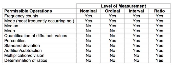
Anyway, a glance at Table I highlights the problem associated with this notion of numerical levels. It shows which operations are legitimate and which are not for the various levels of measurement.

Table I
As Table I shows, multiplication, division, and the determination of ratios are only legitimate for ratio numbers, and even addition, subtraction, and the calculation of means requires at least interval numbers. Indeed, it doesn’t even make sense to examine the spread between numbers if they’re ordinal numbers.
To return to Likert scales, the question I would like to pose is this: What type of numbers do they yield?
There’s a general consensus among statisticians that Likert scales meet the criteria for yielding ordinal numbers, but there is a great deal of doubt that they yield interval numbers. They certainly do not yield ratio numbers.
As Robins and Heiberger (“Plotting Likert and other rating scales”) put it:
Assigning the value of 5 to strongly agree, 4 to agree, and continuing down to 1 for strongly disagree and then taking means is a common practice. However, it is controversial since there is no assurance that there is even spacing between the descriptions of attitude. There is no reason to assume that the distance between agree and strongly agree is the same as the distance from agree to neither agree nor disagree. Even if it were acceptable to take means, it is not very useful. One hundred respondents giving a score of three tells a very different story from 50 respondents giving a score of five and 50 respondents giving a score of one, yet these two situations both have a mean of three.
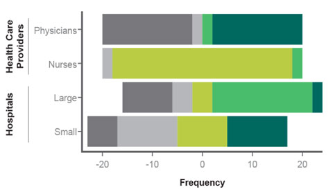
Figure 1. Hypothetical Likert results |
As a consequence, Robbins and Heiberger argue for presenting Likert data as “diverging stacked bar charts,” where the relative frequencies of the chosen options are presented, as a function of other variables of interest, as shown in Figure 1. Figure 1 shows hypothetical data from 80 people who were asked to rate the degree to which they agree or disagree with the statement “I love infusion-pump prototype A.” In this hypothetical example, there were 20 people in each cell defined by type of medical professional (physician or nurse) and type of hospital in which they work (large or small)—40 physicians and 40 nurses; 40 professionals who work in large hospitals, 40 in small hospitals.
The figure illustrates four ways that the data can yield a mean rating of three. Physicians either hate the prototype or they love it, with few in the middle. Nurses don’t have much of an opinion one way or another. Few of the people from large hospitals are excited by it, but most like it. However, a significant group really dislikes it. By contrast, a large group from small hospitals really loves it and a large group is mildly negative toward it.
My point here is that reporting the data as such data are often reported, as average rating scores, obscures just about everything of interest. Physicians and nurses, and people from large and small hospitals all, on average, rate the prototype as 3—neither like nor dislike—so reporting the results in terms of average Likert scores leads to the false conclusion that all four subgroups responded identically to the prototype.
In sum, Robbins and Heiberger present a problem and propose a solution.
The problem is that once Likert scales are translated into simple numbers, they become ambiguous regarding their level; they, in effect, pose as ratio numbers when they’re actually ordinal numbers. As they’re passed from one person to the next, there’s no way to keep people from applying the mathematical manipulations they know how to use—pooling data to obtain means of means, deriving standard deviations, adding and subtracting, looking at ratios, etc. This problem of fallacious quantification generates conclusions that, literally, don’t make sense.
And, as the previous example illustrates, fallacious quantification can also completely hide what’s actually interesting about the data.
The solution that they present is, so to speak, to leave the data intact by presenting them via their “diverging stacked bar charts” or something similar. The idea is to summarize what people actually say rather than engage in fallacious quantification (i.e., turning the data into simple numbers). Simple numbers are convenient, but they can also be ambiguous and misleading, resulting in disastrous results. Or, to put it another way, quantification is good, but fallacious quantification is not.
Stephen B. Wilcox is principal and the founder of Design Science (Philadelphia), a 25-person firm that specializes in optimizing the human interface of products including medical devices, and a member of MD+DI's editorial advisory board.
You May Also Like


