


.png?width=300&auto=webp&quality=80&disable=upscale)

Sponsored Content
From Our Partners
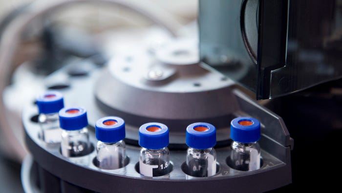
Protein Adhesion and Metal Interaction in Medical Diagnostic Equipment
Abbott Laboratories and SilcoTek share research on coatings to prevent unwanted protein adsorption on 316L stainless steel.
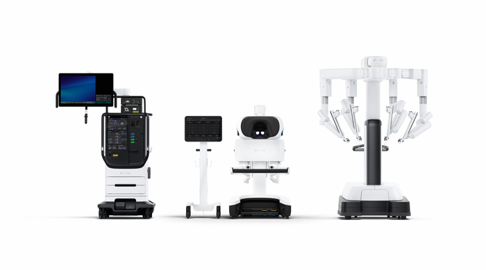
The new robot launch will make it harder for competitors to dethrone the robotics king.
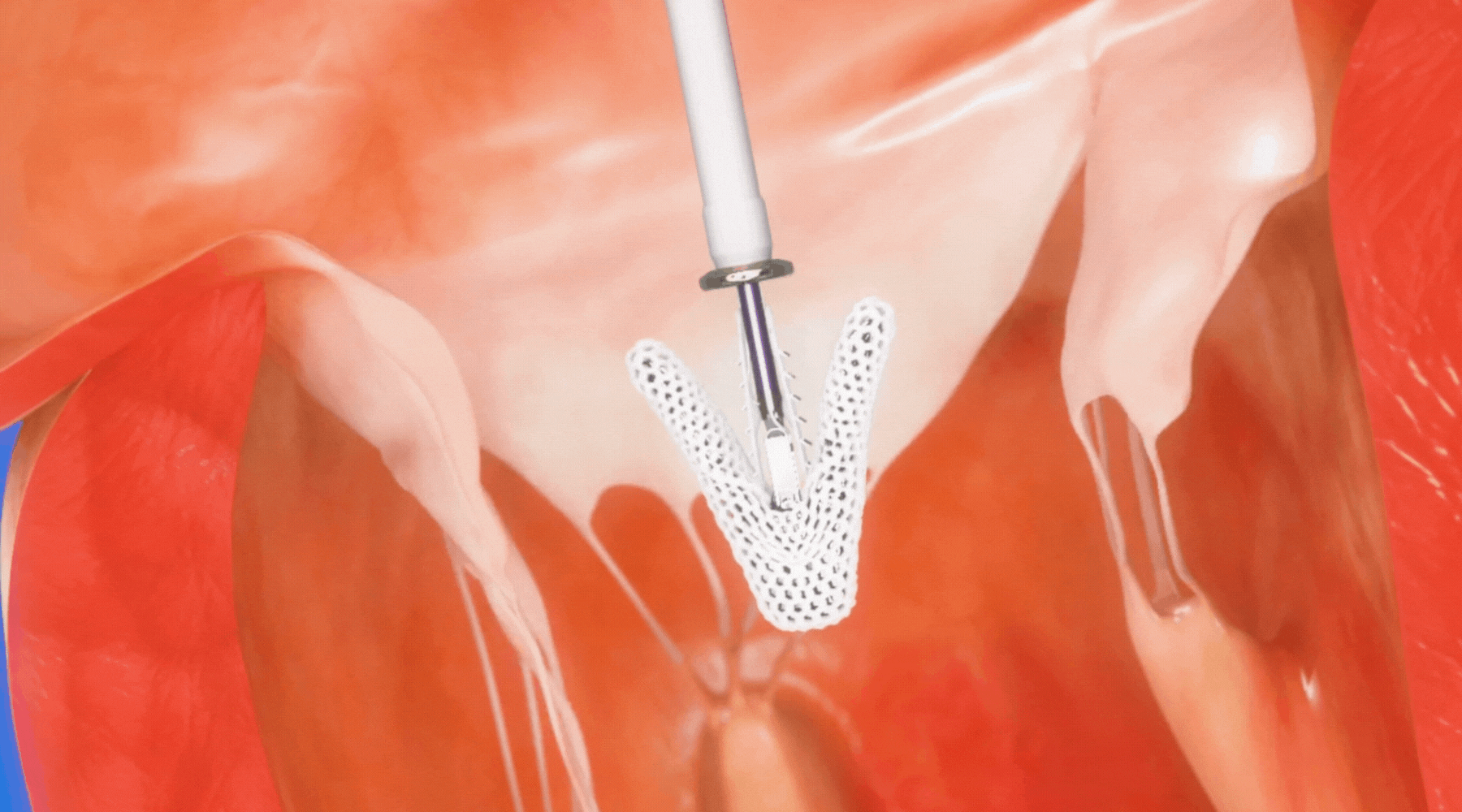
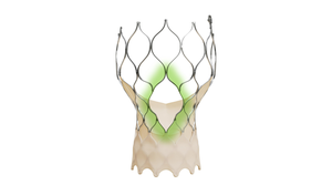
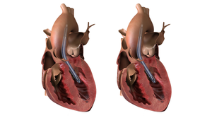
The cardiovascular market is one of the hottest segments in the medical device industry. MD+DI looks at the companies making the most noise in cardiology.
Abbott Laboratories and SilcoTek share research on coatings to prevent unwanted protein adsorption on 316L stainless steel.
Recent

.svg?width=700&auto=webp&quality=80&disable=upscale)


 lab in 2015. While a doctoral student at UGA, Jones studied antibacterial bioplastics.")